The Andover Companies Branding & Website

What their logo looked like before…
As you can see, the gun is defying the laws of gravity by just barely resting on the pilgrim and appears to be much smaller than it should be. And with no real light source it makes the man look like he's horribly disfigured.

The First Step
In order to get the proportions and light source right, I recruited another coworker and photographed him in a pilgrim costume.
Start Sketching

Refine Sketches & Finalize Typography
The refining process consisted of giving the pilgrim a haircut, a shave, modifying the brim of his hat, and giving him a cloak to get the final result.
The logo uses the typeface 'Oxtail' which is based off of early 19th century font styles.

The secondary use wordmark.
Brand Guidelines
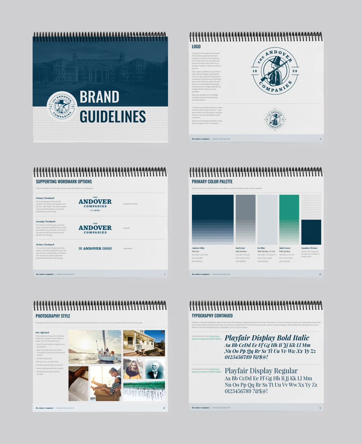
Snippets from the Brand Guidelines I created.
Print Assets
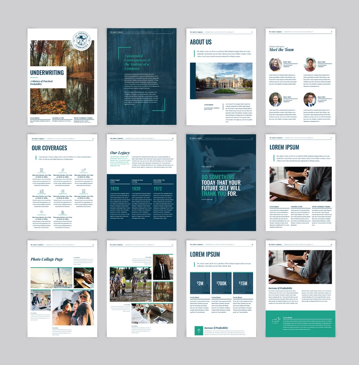
Snippets from the brochure template I designed.
Brand New Digital Experience

What their website looked like for 17 years.
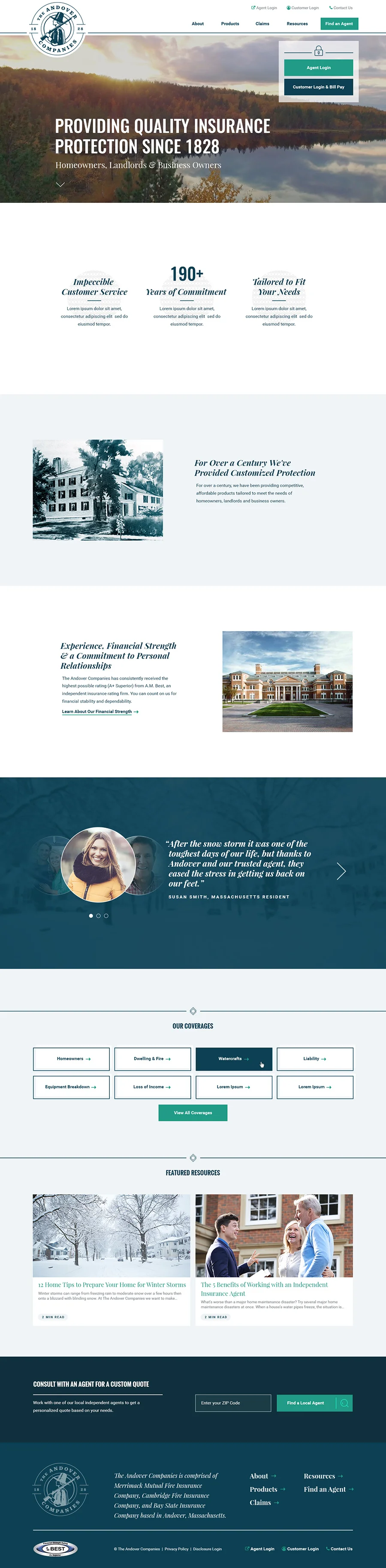
The Andover Companies has been providing quality insurance protection since 1828 but haven't had a genuine logo or website in almost two decades. They had a lot of brand recognition is the use of their pilgrim and wanted to keep that but needed the new look to show the legacy and class that is Andover.
Sole Art Director at Boston Digital
Branding
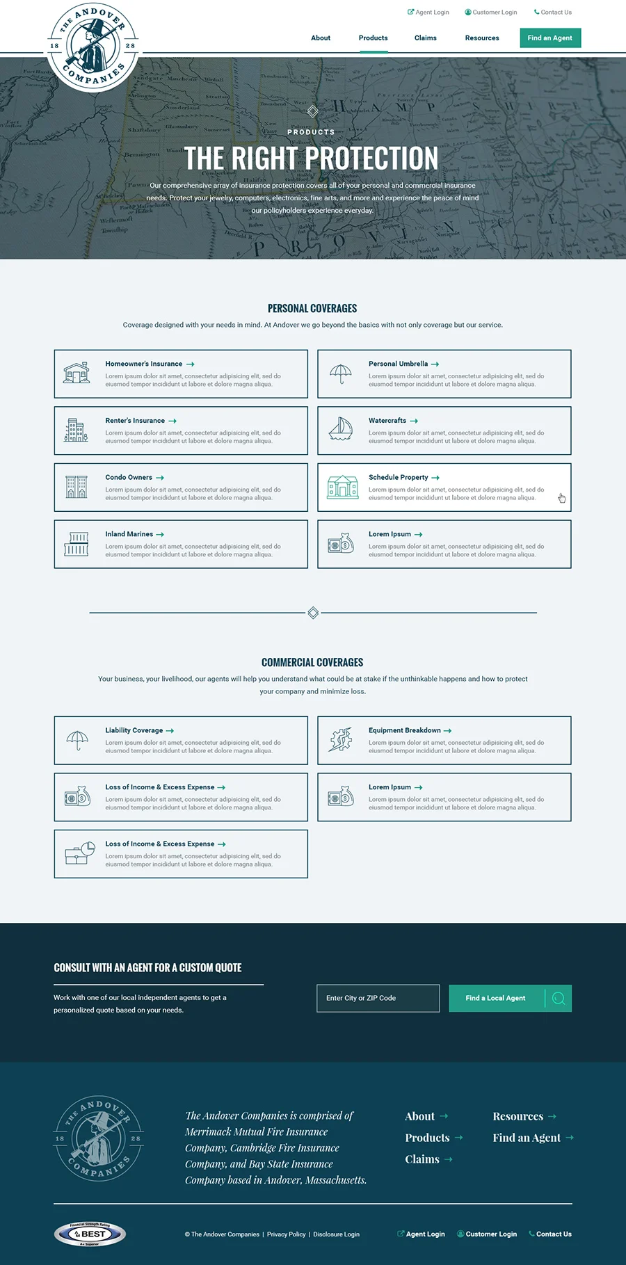
Responsive Website
Drupal
B2C